The Public Website
The welcome page is served at the root of the application and is the only screen a visitor sees before deciding whether to register.
The welcome page is served at the root of the application and is the only screen a visitor sees before deciding whether to register. It has three jobs, in order: explain what the product does, give enough evidence to believe it, and route the visitor onward — into registration, into an existing account, or into a conversation.
The page at a glance
The page is built from thirteen stacked sections and runs to roughly 11,354 pixels at desktop width. The figure below shows the whole page reduced to fit, with each section numbered down the left margin.
| # | Section | What it does |
|---|---|---|
| 1 | Header / navigation | Fixed bar with the brand, navigation and account actions. |
| 2 | Hero | Headline, calls to action and a product preview. |
| 3 | Features | Six cards naming the main capabilities. |
| 4 | Product tour | Captioned screenshots of the application. |
| 5 | Why choose us | Four differentiators and a trust panel. |
| 6 | About | Company background, mission, values and vision. |
| 7 | Team | The people behind the product. |
| 8 | Testimonials | Customer quotes and an aggregate rating. |
| 9 | Pricing plans | Subscription tiers with a billing toggle. |
| 10 | FAQ | Seven expandable questions. |
| 11 | Newsletter | Email capture for announcements. |
| 12 | Contact | Enquiry form and contact details. |
| 13 | Footer | Grouped links, social links and copyright. |
Header and navigation
The header is fixed to the top of the window and stays visible as the visitor scrolls, so the two account actions are always one click away. It carries the brand on the left, the navigation in the centre and the account actions on the right.

1 Brand wordmark — the company name or logo, linking back to the top. Set from the landing page settings.
2 Primary navigation — in-page anchors and standalone pages. The anchors scroll; the rest navigate.
3 Login — sends an existing user to the sign-in screen.
4 Get Started — the registration route, shown only when the platform runs in multi-company mode.
Hero
The hero fills the first screen: a headline stating the proposition, a supporting line naming the areas covered, two actions — register or sign in — three statistics used as proof, and a screenshot of the real dashboard.
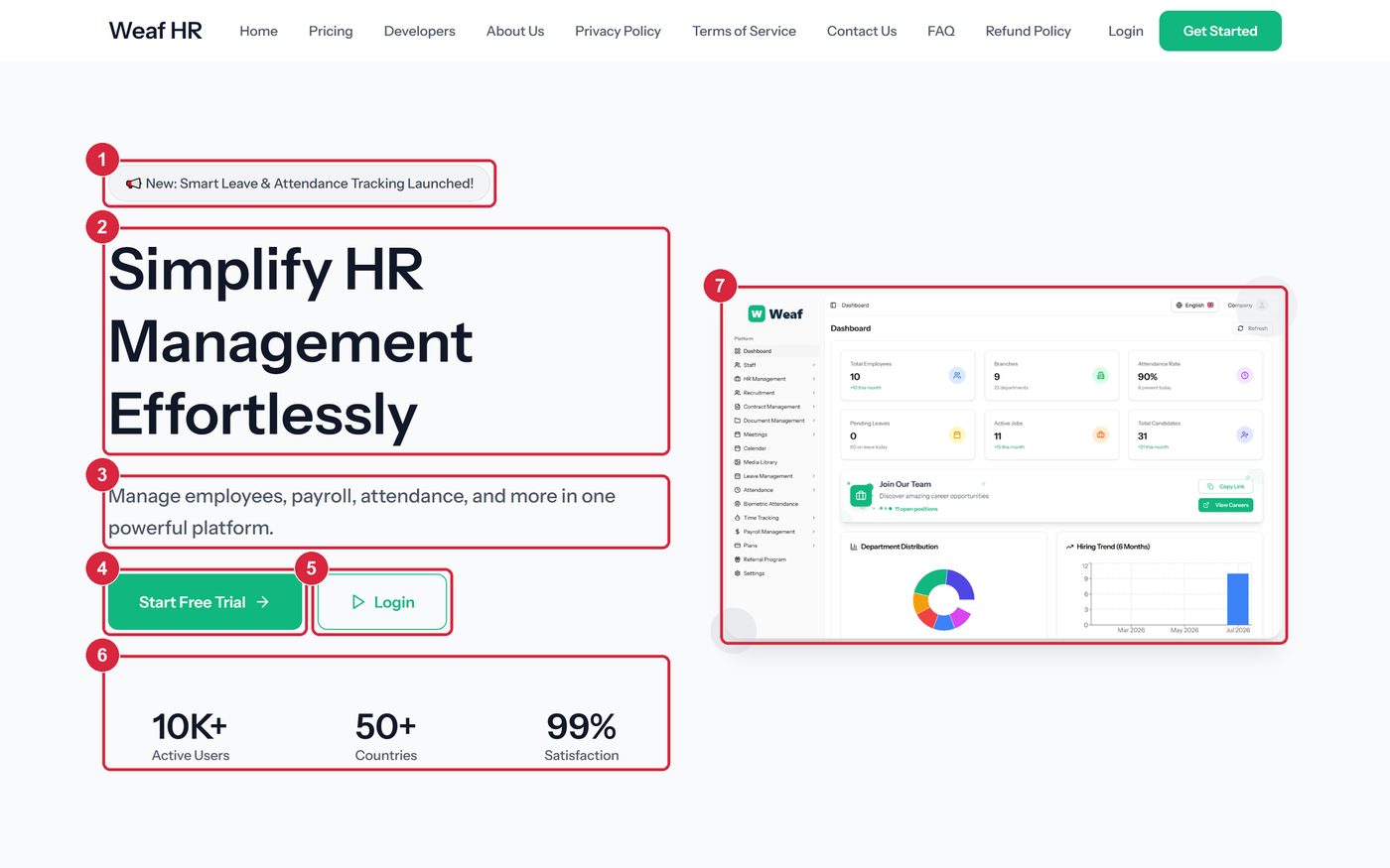
1 Announcement pill — an optional one-line notice for the most recent release. Left empty, it disappears.
2 Headline — the main proposition, and the page’s only level-one heading.
3 Supporting line — one sentence naming the areas the platform covers.
4 Primary action — the conversion route into registration.
5 Secondary action — the route for people who already have an account.
6 Proof statistics — three configurable figures used as social proof.
7 Product preview — a screenshot of the real dashboard, so the first impression is the product rather than an illustration.
Features
Six cards summarising what the platform does, each with an icon, a name and a single sentence. The intent is scannability; the detail belongs to the tour that follows.
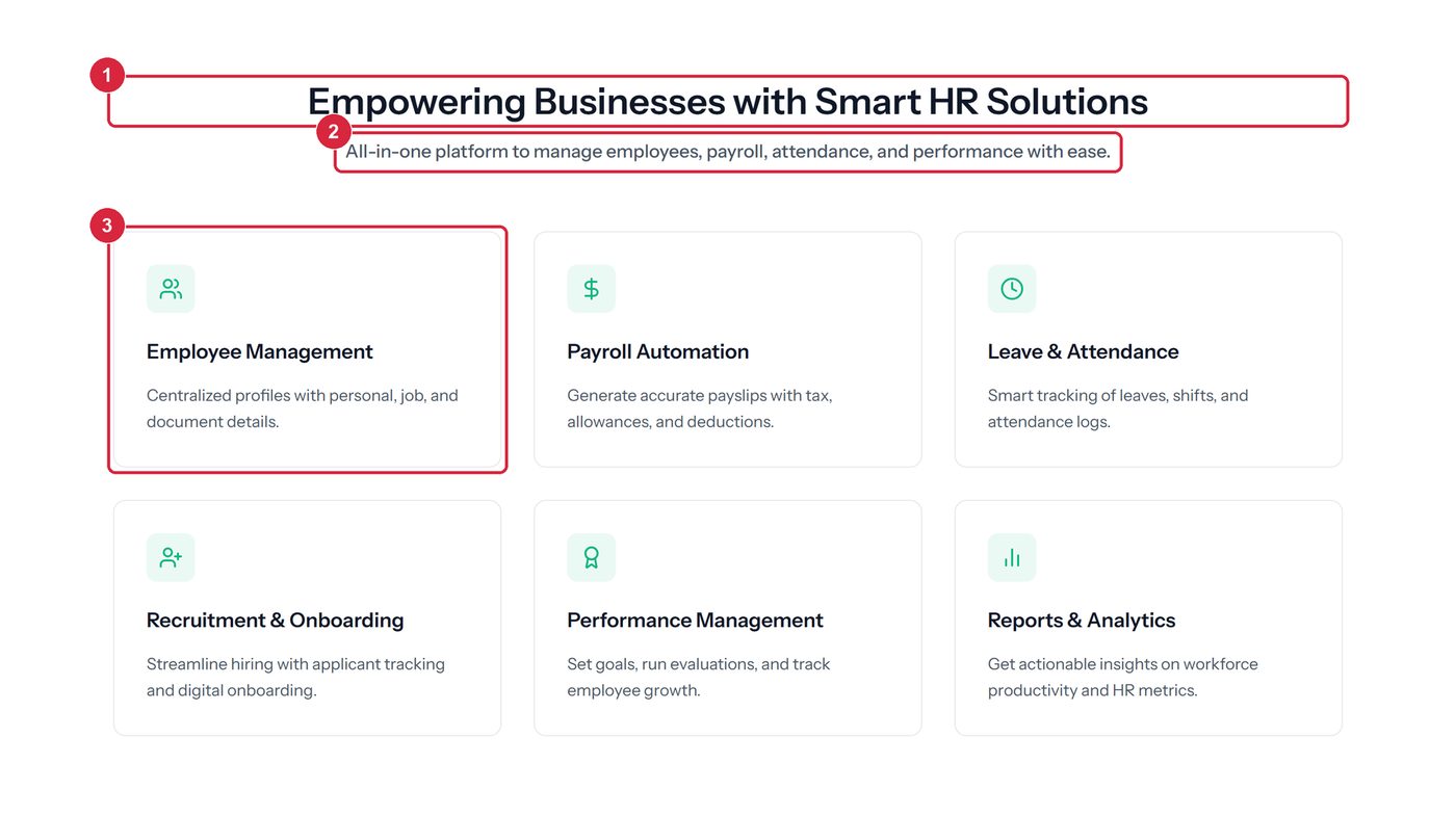
- 1 section heading
- 2 section subtitle
- 3 feature card
Product tour
Where the features section asserts, this one shows: six captioned screenshots of the working application, each labelled with the module it comes from.
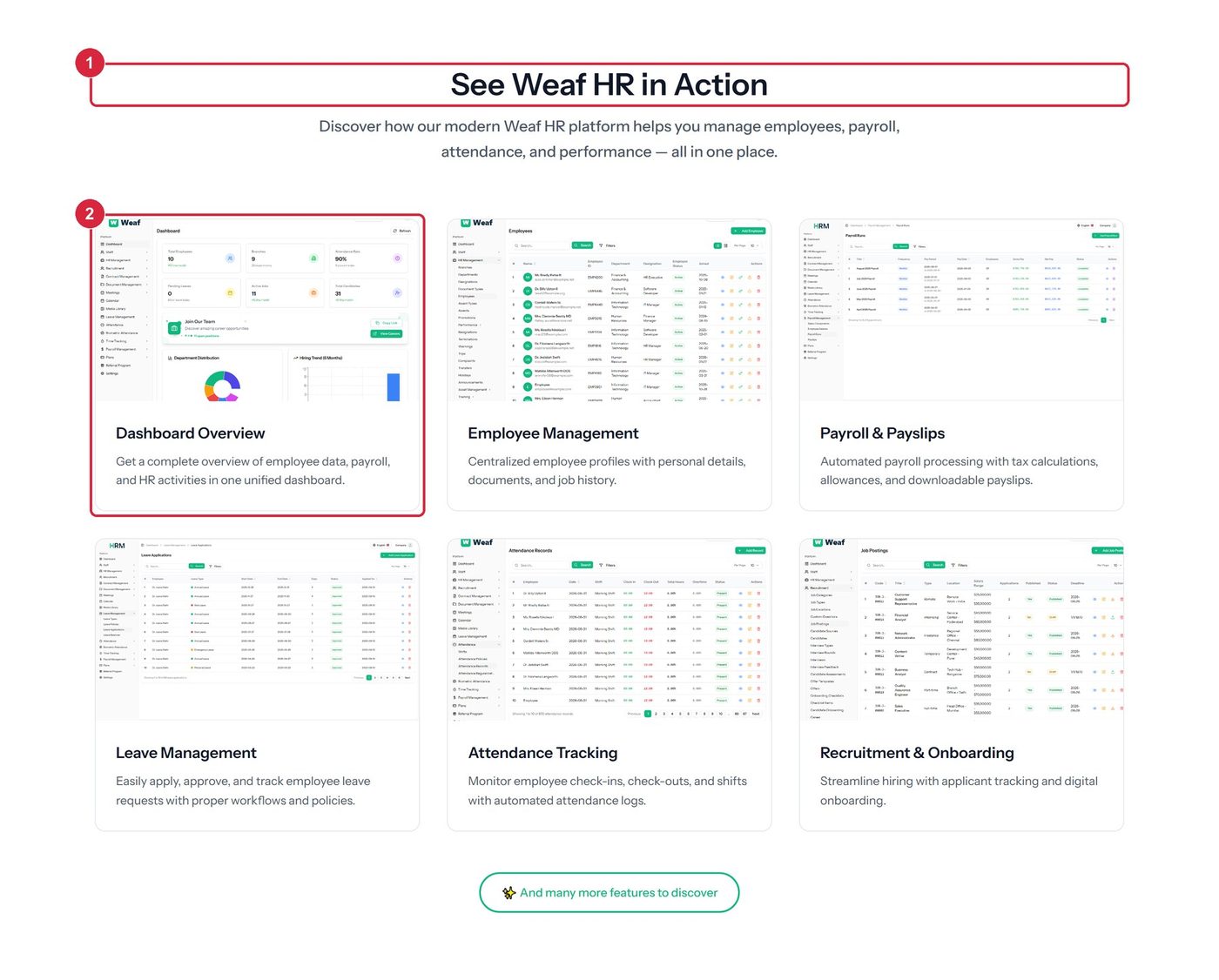
- 1 section heading
- 2 one captioned screen
Why choose us
Four differentiators beside a panel of adoption and satisfaction figures. This answers the comparison question rather than the capability question.
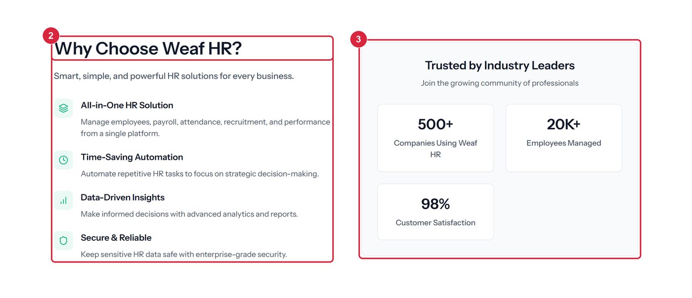
- 1 section heading
- 2 one differentiator
- 3 adoption and satisfaction panel
About
The company rather than the software: how long it has operated, who it serves, and four statements covering mission, values, commitment and vision.
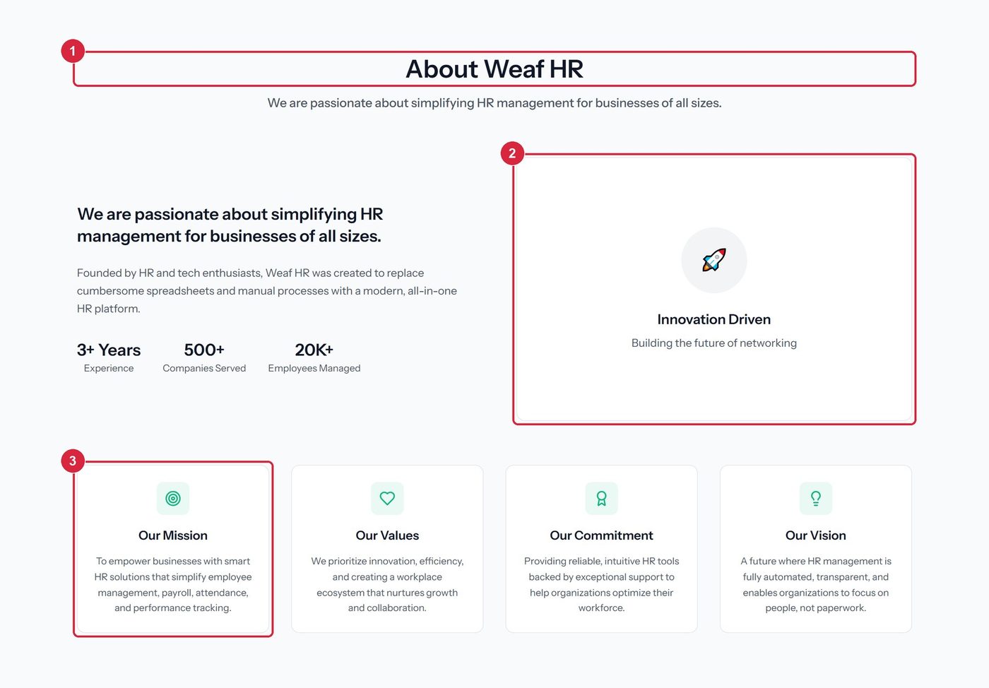
- 1 section heading
- 2 highlight panel
- 3 one of four value cards
Team
Named people with roles and photographs, followed by a recruitment prompt linking to open positions.
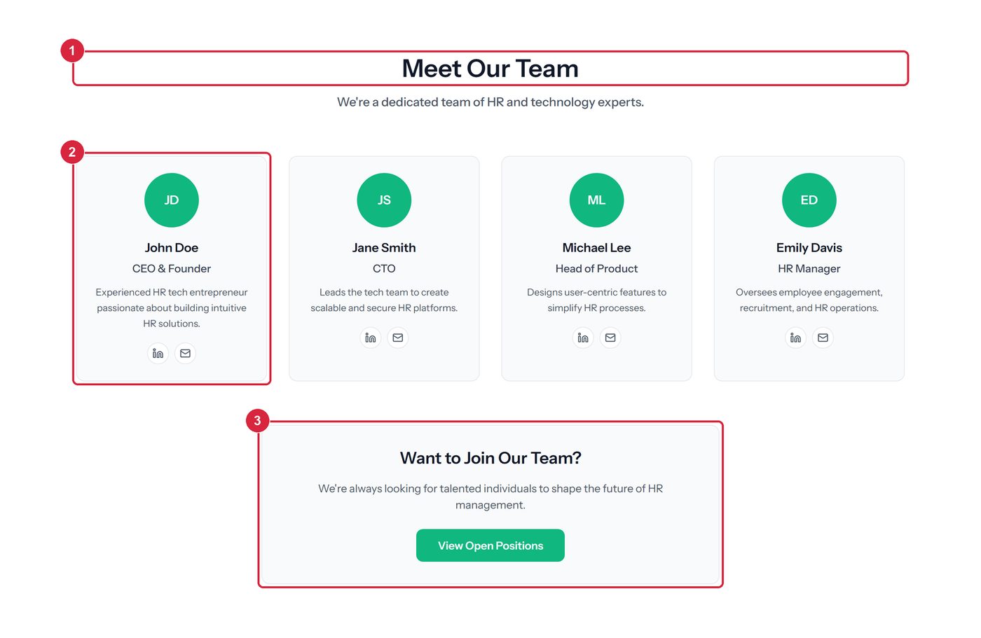
- 1 section heading
- 2 a team member
- 3 recruitment prompt
Testimonials
Customer quotes with star ratings and attributed authors, closing with an aggregate rating panel. These are records in the system, so they can be added or withdrawn without a release.
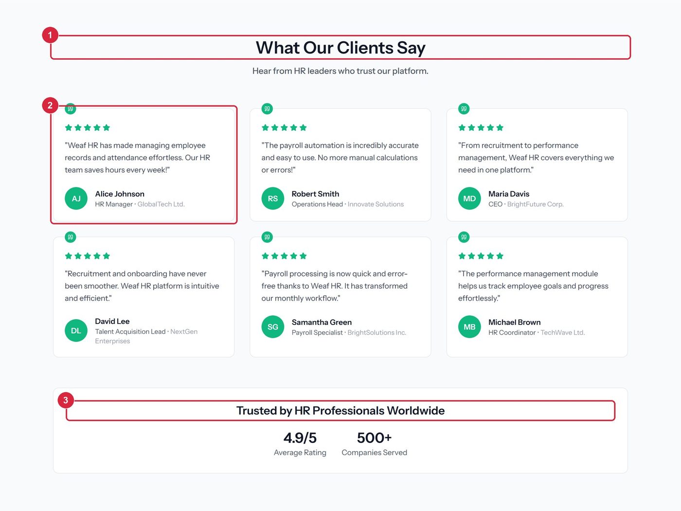
- 1 section heading
- 2 one testimonial
- 3 aggregate rating
Pricing plans
Three plans side by side, with the recommended plan raised and badged. Each card states its price, the usage limits that define the tier, the features it unlocks and its own call to action. A toggle switches every price between monthly and yearly.
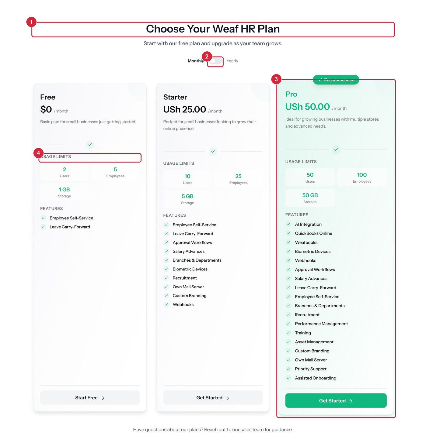
- 1 section heading
- 2 billing period toggle
- 3 the recommended plan
- 4 usage limits
Frequently asked questions
Seven questions in an expandable list, collapsed by default, covering how the platform works, payroll and leave automation, data security, recruitment, appraisals, reporting and plan changes.
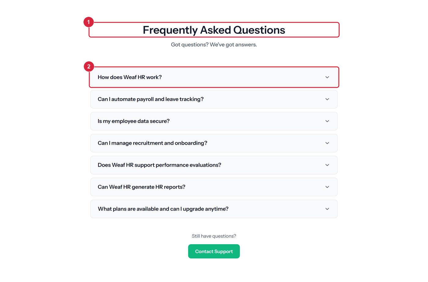
- 1 section heading
- 2 one collapsed question
Newsletter
An email field and a subscribe button, with three lines describing what a subscriber receives. Submission is handled without leaving the page.
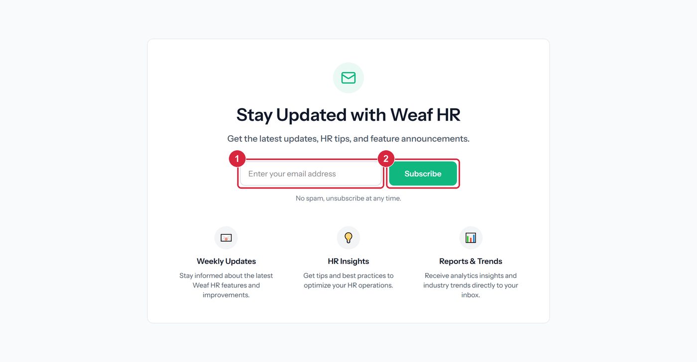
- 1 email field
- 2 subscribe
Contact
An enquiry form beside the company’s published contact details, so a visitor can choose between writing on the page and using their own email or telephone.
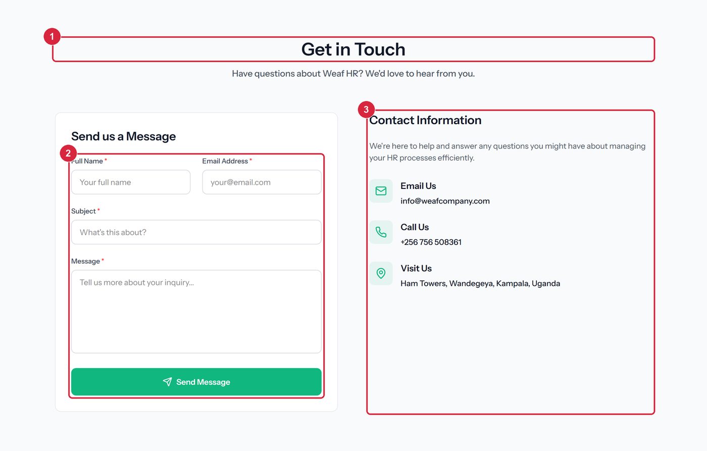
- 1 section heading
- 2 enquiry form
- 3 published contact details
Footer
Five columns of links, a second subscribe box for visitors who reached the bottom without acting, social links and the copyright line. The Developers entry leads to the public API documentation.
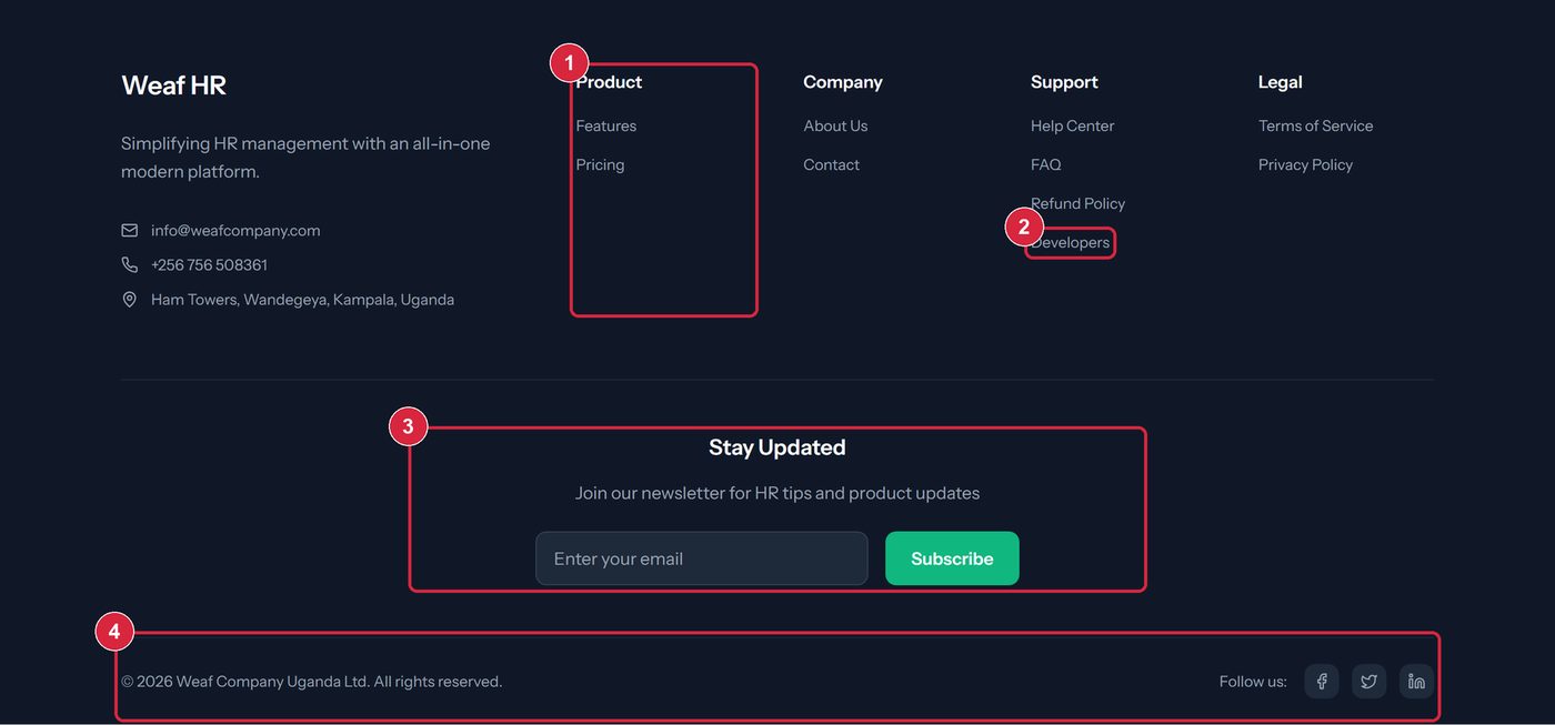
- 1 one of five link columns
- 2 developers (api docs)
- 3 second subscribe box
- 4 copyright and social links
Where the navigation leads
| Label | Destination | Type |
|---|---|---|
| Home | / | Page |
| Pricing | /pricing | Page |
| Developers | /api/docs | Public API documentation |
| About Us | /page/about-us | Content page |
| Privacy Policy | /page/privacy-policy | Content page |
| Terms of Service | /page/terms-of-service | Content page |
| Contact Us | /page/contact-us | Content page |
| FAQ | /page/faq | Content page |
| Refund Policy | /page/refund-policy | Content page |
| Login | /login | Authentication |
| Get Started | /register | Authentication |
The six content pages are not fixed in code. They are custom pages created in the administration area, and each appears in this menu automatically once published — see chapter 21.
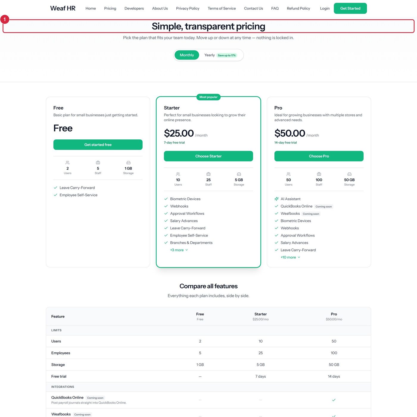
The pricing page
The same plans as the welcome page, on a page of their own so the comparison can be linked to directly.
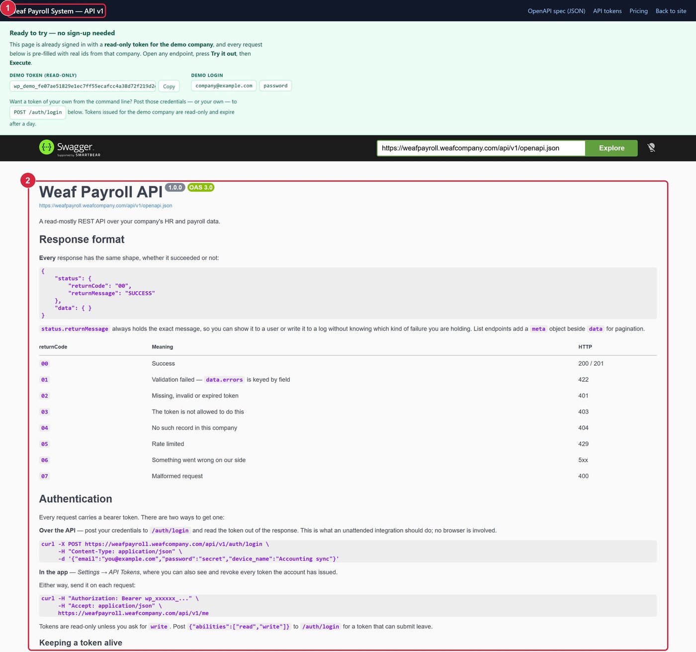
The developer documentation
Public API documentation with every endpoint listed and a console for trying them. It requires no account, so a developer can evaluate the platform before anyone signs up.
How the public site is maintained
None of the welcome page is fixed in code. Its text, images, ordering and visibility are stored as settings and applied when the page renders, so the marketing site can change without a deployment. It is administered at /landing-page/settings, which is restricted to super administrators.
- Content — text, images, statistics, team members and headings.
- Order — the sequence of the thirteen sections.
- Visibility — whether a section appears at all; a hidden section is not rendered rather than merely concealed.
Plans, testimonials, FAQ entries and custom pages are records rather than settings, maintained in their own parts of the application. The welcome page renders whatever is currently published, which is why the figures in this chapter are true as at the date on the title page.